Svenska kyrkan
Next level navigation
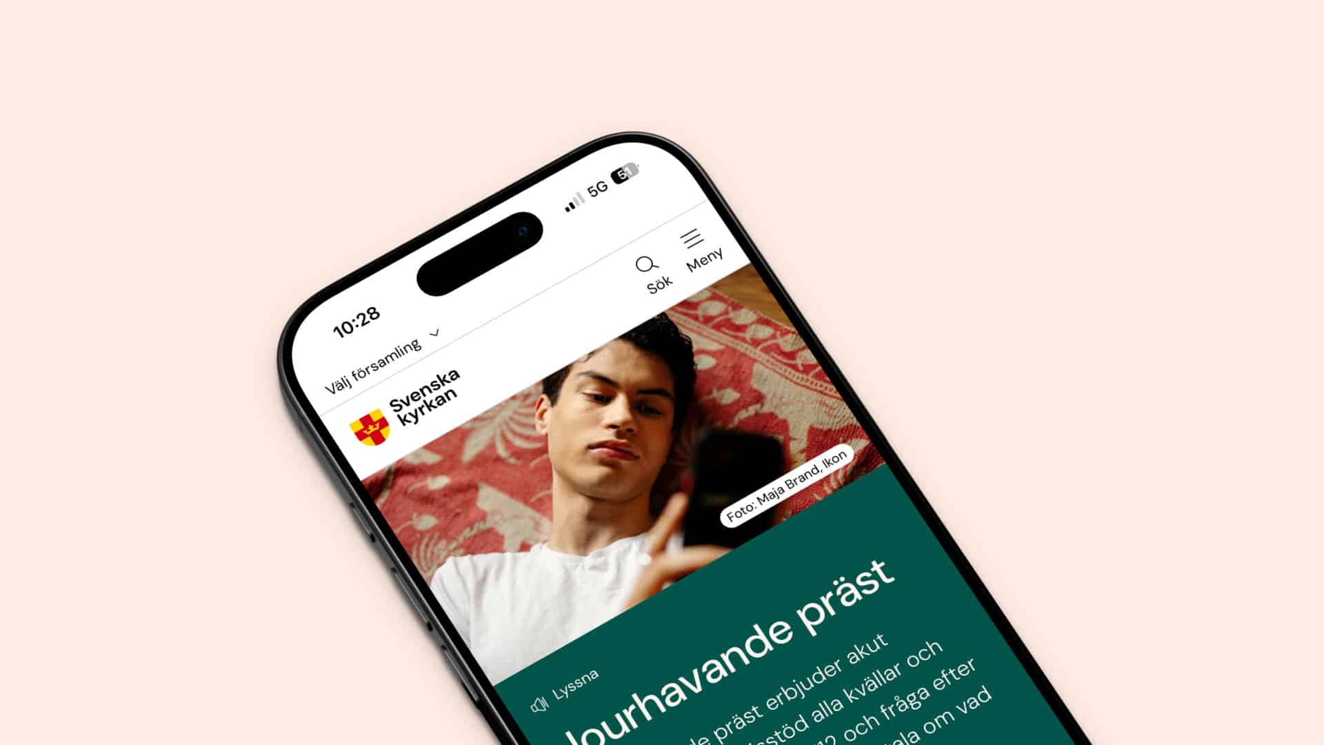
The infamous hamburger menu has been haunting us for years. Through extensive user testing, we discovered a new way to navigate the massive structure of svenskakyrkan.se, a website containing more than 600 subdomains.
If it ain’t broke, don’t fix it
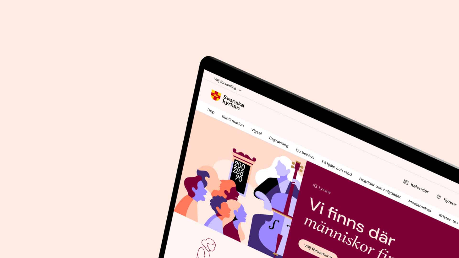
We initiated the project by thoroughly examining the existing navigation system, both through an extensive web service index report based on 3343 user responses and through qualitative user testing. These tests were conducted on both mobile and desktop devices and recorded for closer analysis. Every aspect was carefully reviewed to determine which parts of the existing navigation were effective and which required improvement.
The disadvantage of the
hamburger menu
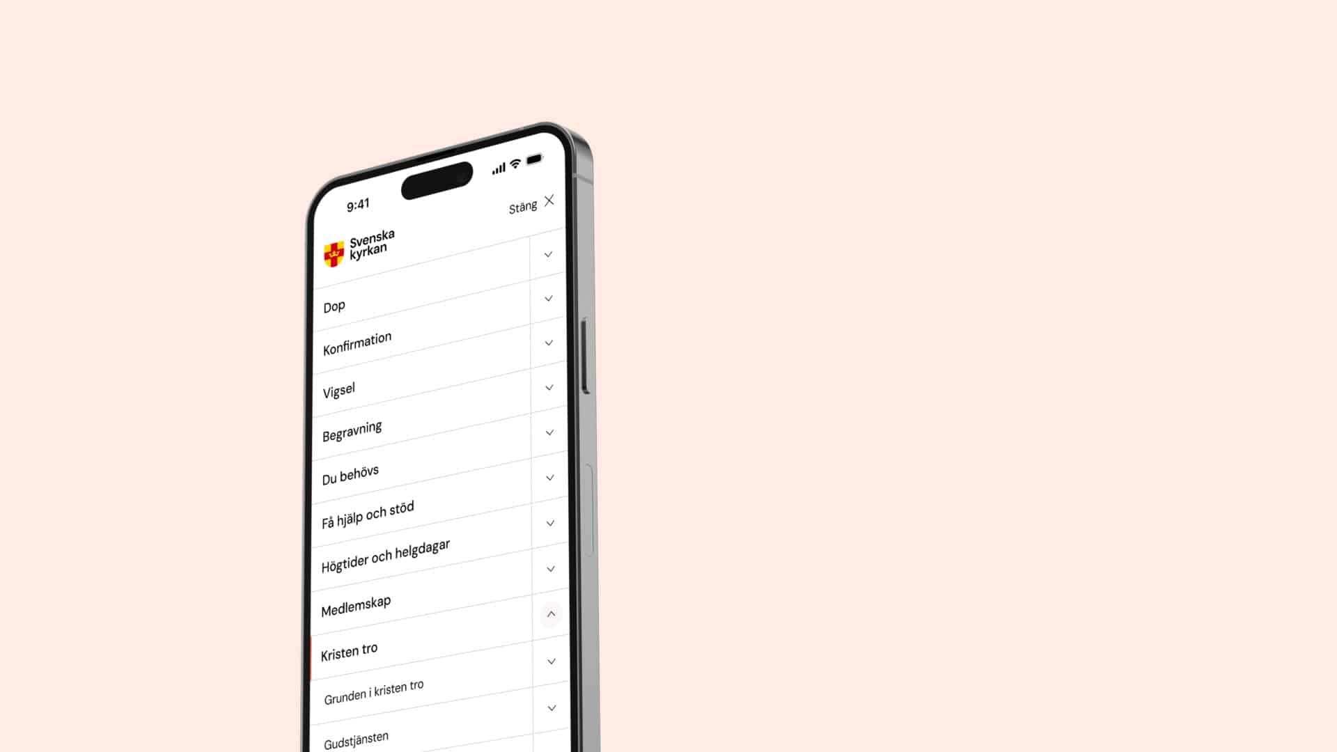
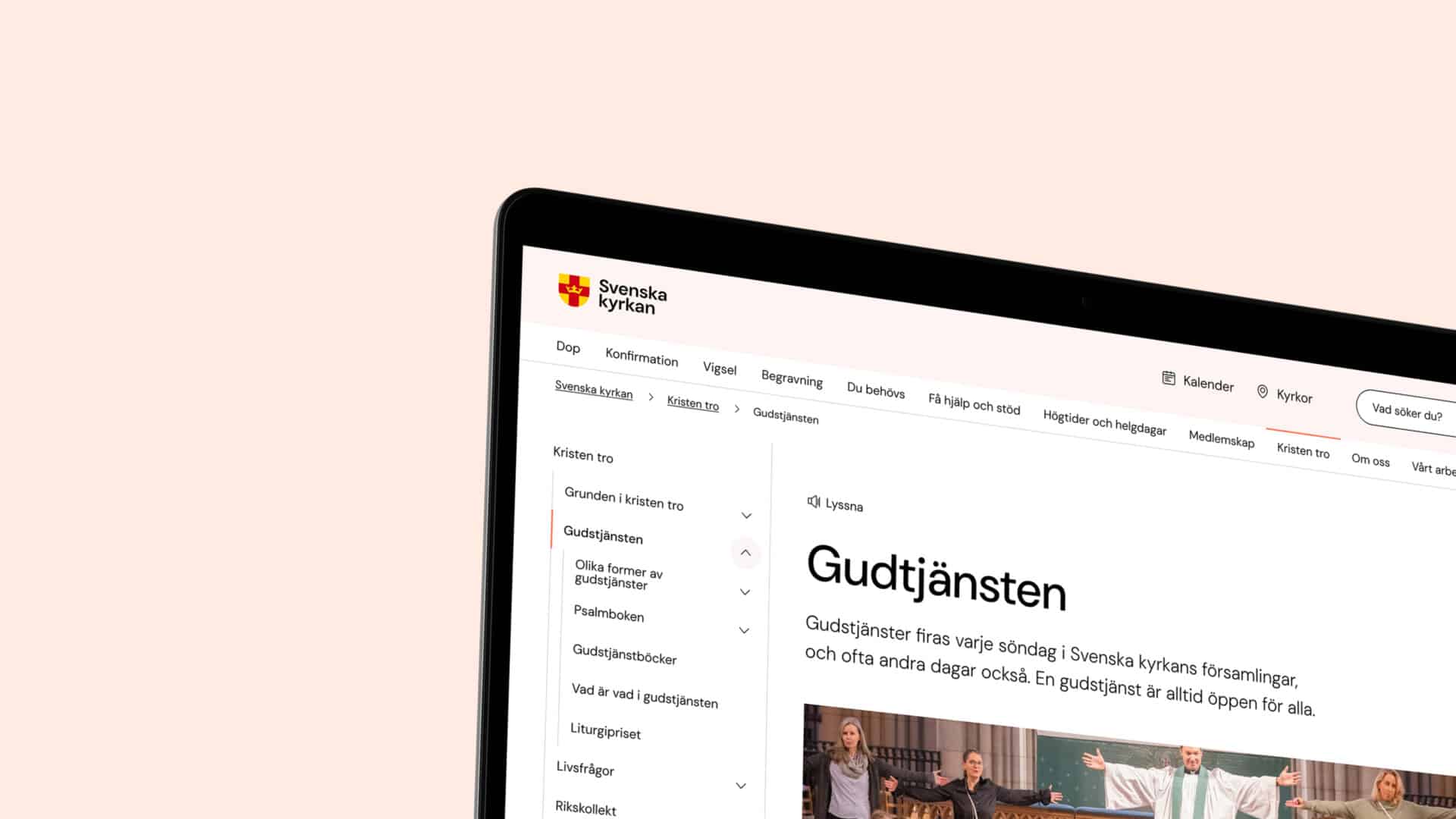
Hamburger menus are everywhere on the internet. They are certainly useful on smaller screens where space is limited, but they are also frequently criticised for hiding key features and navigation when space is not a concern. Our research led to the hypothesis that a classic, persistently accessible header navigation with direct links would help users navigate the site more efficiently, possibly in combination with a redesigned submenu.
Prototyping our
way forward
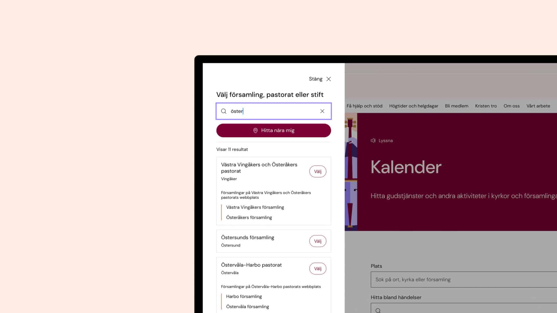
Based on key insights from the report and the user tests, several prototypes were developed and tested with new participants. All participants were carefully selected to represent different age groups and varying levels of familiarity with the Svenska kyrkan website, including first-time users.
After reviewing the results from the first round of testing, we iterated the design multiple times and developed updated prototypes based on the feedback. The prototypes were then evaluated in a second round with an additional group of users, whose feedback ultimately shaped the final design implemented on the live website.
Building a lighter
navigation
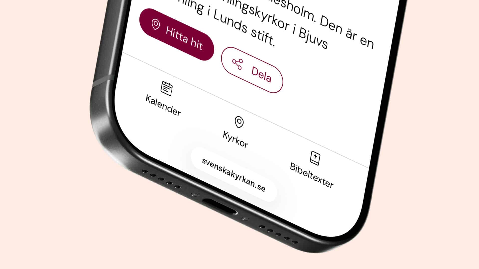
A new design also opened up possibilities in development. Previously, the entire navigation of a website was included on every page, whether visitors needed it or not. On the largest websites, the navigation alone could add thousands of lines of markup to every page.
The new navigation takes a different approach. The most important parts are available from the start, while everything outside the current section is loaded only when needed.
For a website as large and complex as svenskakyrkan.se, these changes make a significant difference. Reducing unnecessary content while keeping the navigation fast, accessible and easy to use.
The ultimate test
Launching the final design to a broad audience is not the end of the project, but rather the ultimate test. By continuously gathering insights and feedback from members and editors using the navigation in real-world situations, we can better understand how the experience performs over time. The valuable input collected from across the country will serve as the foundation for further improvements to the user experience, accompanied by ongoing qualitative follow-up testing.