
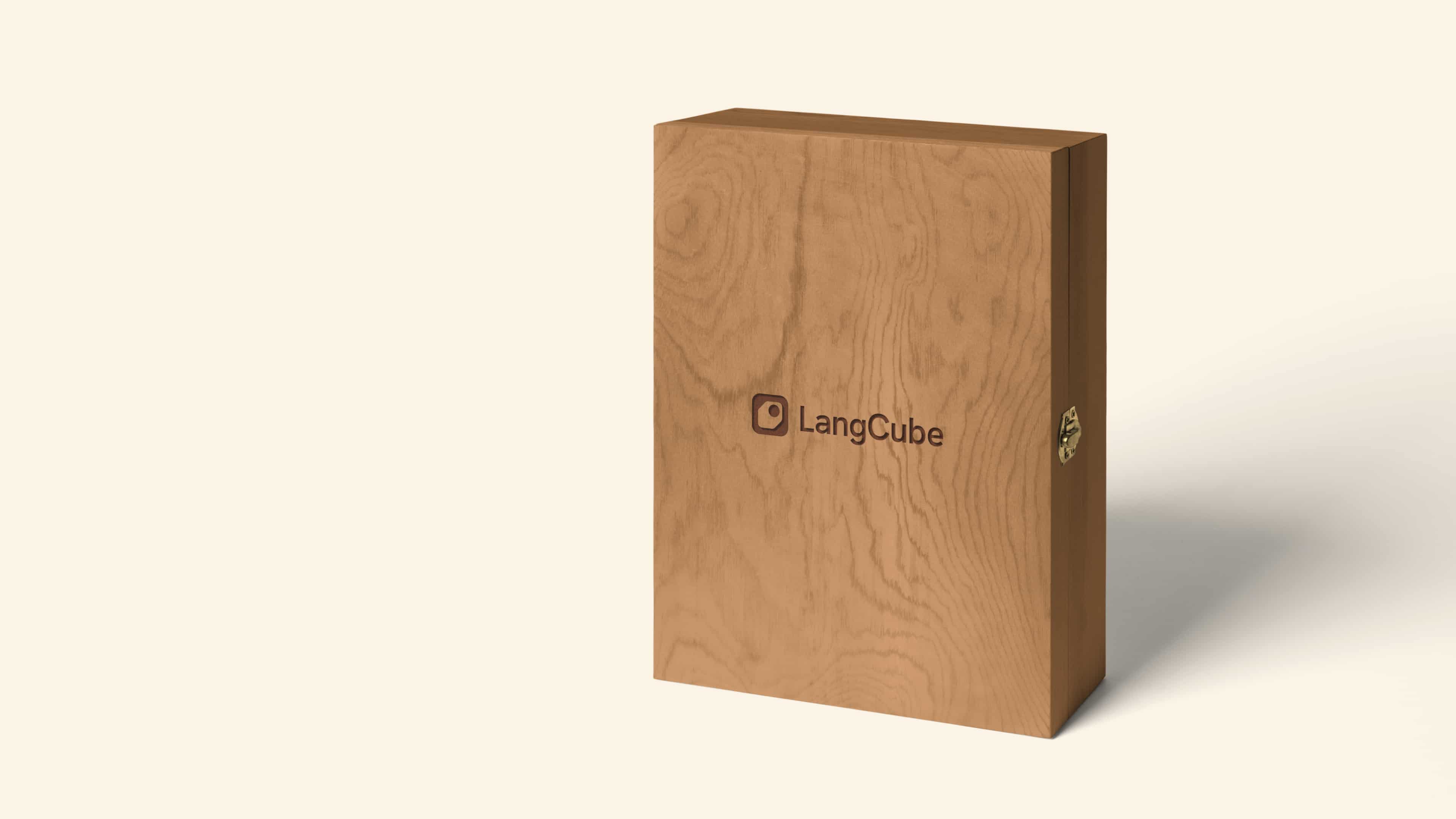
LangCube
Professionally playful
We created the visual identity for LangCube, an upcoming board game designed to revolutionise language learning. By bringing back the tactile experience it serves as a contrast to many of today’s language learning apps. This influenced a retro infused identity with a playful but sober expression.

Walking a fine line
The main challenge with the visual identity was to find a good balance between playful and professional. We wanted something bold and colourful to engage the broad target group, reaching from kids to adults, yet something reliable and educated.
This led us to the retro inspired colour palette, expressing maturity while maintaining the colourful ambition. The muted colours also serves as a homage to classic board games, evoking the perfect amount of nostalgia.


Following standards to create a bold brand
The full colour palette was tested and designed to meet contrast and accessibility standards. Not only to ensure good readability, but also as we considered the strong contrast an important aspect of the bold expression.
In terms of accessibility the selection of font and typography carries a lot of weight. Hanken Grotesk is a minimalistic sans-serif with a versatile aesthetic and high readability. It comes with a full set of weights, ranging from thin to extra bold, offering complete flexibility. Hanken Grotesk express credibility, but also playfulness when it is combined with the colour palette.


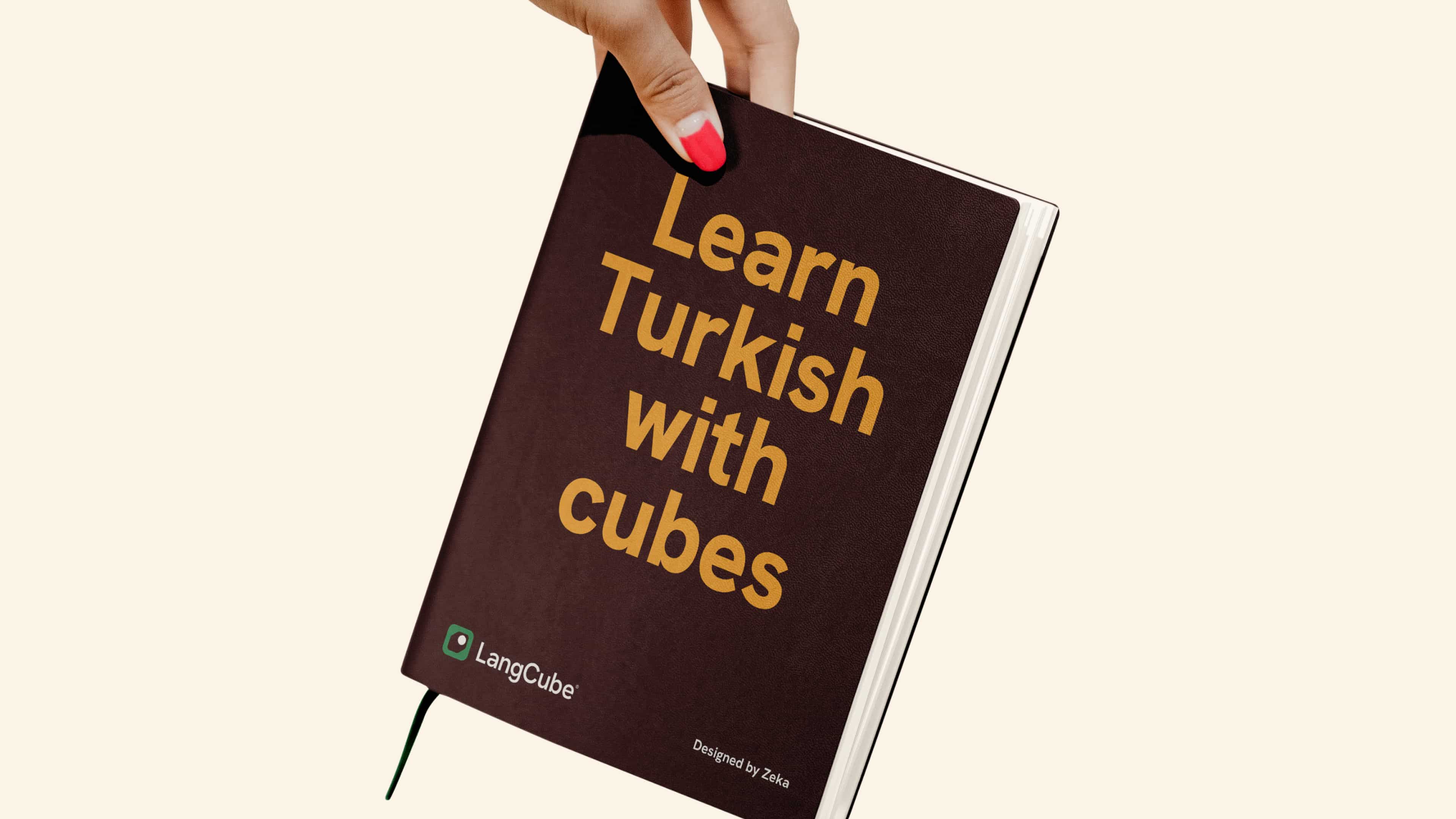
A symbol worthy the game
The logotype symbol emerged from the key game asset, the very object that named the game, the language cube. The simplistic symbol hints to the physical nature of the game.
To complement the identity we created a set of flexible checkered patterns inspired by the game plan. These colourful assets works as key artworks, suitable for brand applications and game accessories.
We also defined a minimalist icon style with symbols representing various cultural objects native to the language. Since the first version of the game is aimed at students learning Turkish, we created symbols depicting the Galata Tower in Istanbul, Turkish tea and the Trojan horse to name a few.


Very satisfying visual
identity work.
Zekeriya Kazanci, Creator of LangCube


