Nanexa
Precision meets humanity
Nanexa is a world leading drug development company for Long Acting Injectables, developing a new generation of innovative products enabled by the unique PharmaShell® technology. We helped them elevate their brand for the future.

Get closer,
experience the details
Inspired by the precise nature of Nanexa’s nanotechnology, which has the potential to significantly improve patients’ quality of everyday life, we wanted to create a human brand with an appreciation for details.
This core idea helped us shape the refined typography and the new graphic element; an exact raster of dots set against a dynamic gradient cloud. It also influenced the image style, which primarily depicts close-up portraits of people captured with a shallow depth of field. Focusing on the very details that make us human.


Energy flows here
Nanexa should also be perceived as an energetic and innovative company, key qualities we wanted to reflect in the visual identity. This is expressed through the movement of the graphic element and the use of bright colours, contrasted with the trustworthy tones of the new colour palette.
The shape of the logotype was kept unchanged to maintain brand recognition, while its colours were updated to align with the new visual identity.


Illustrations crafted with precision
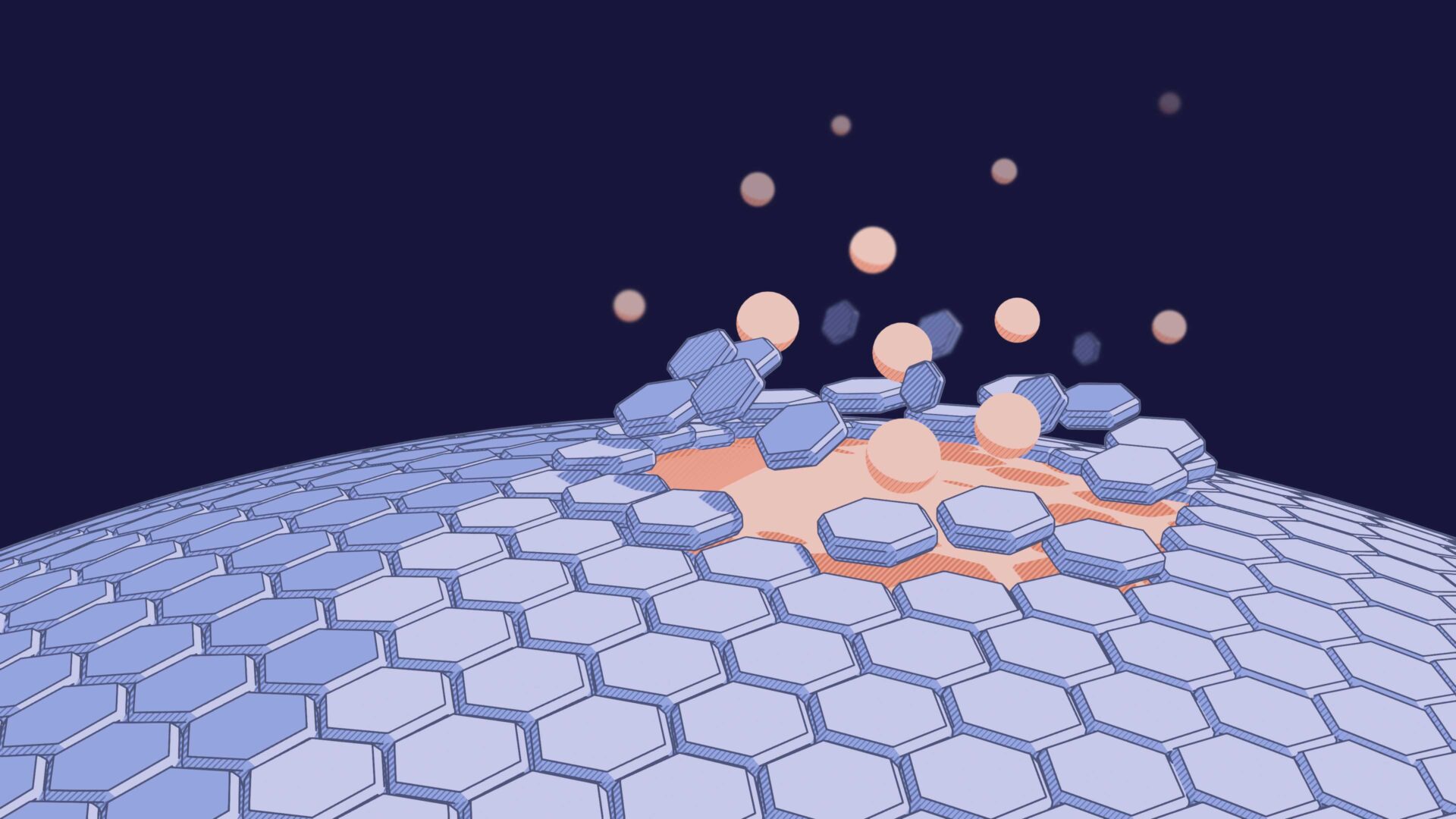
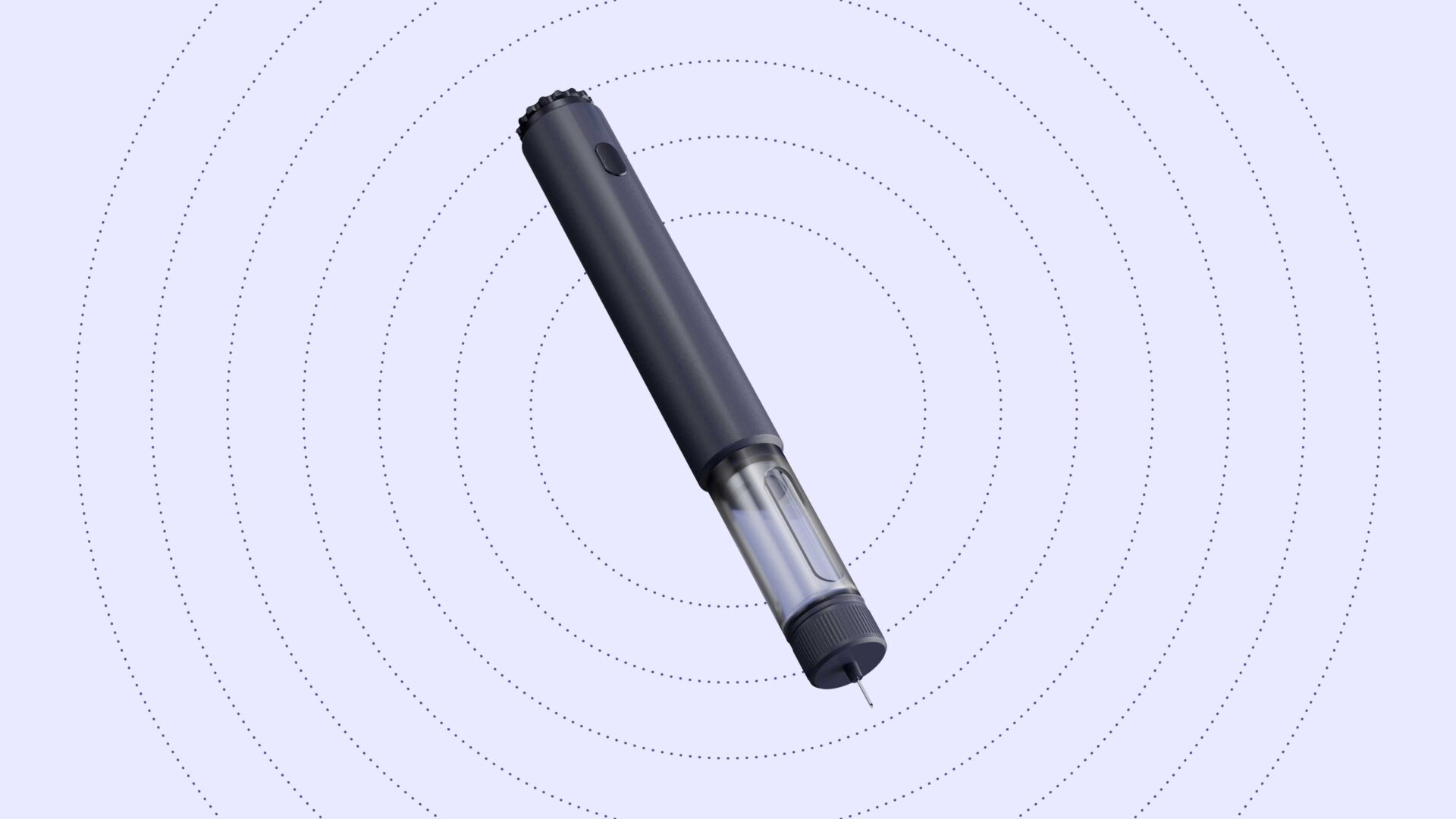
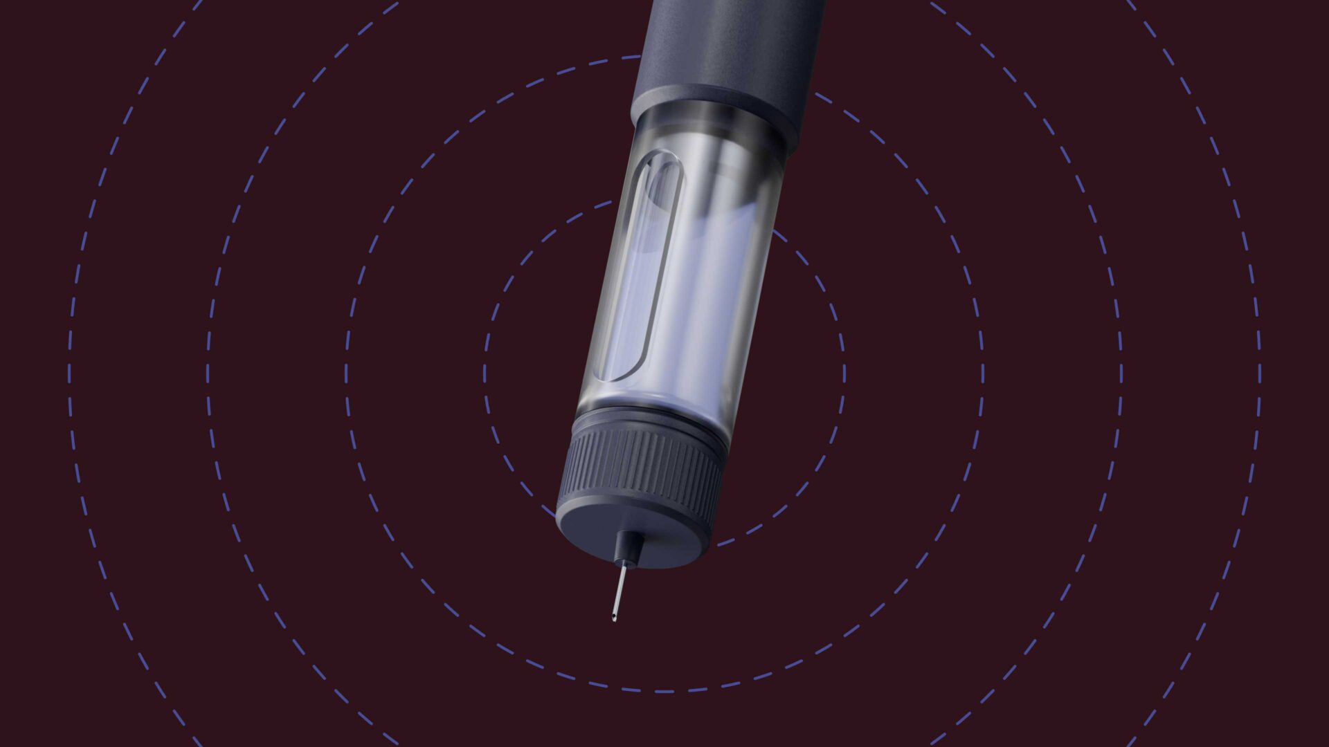
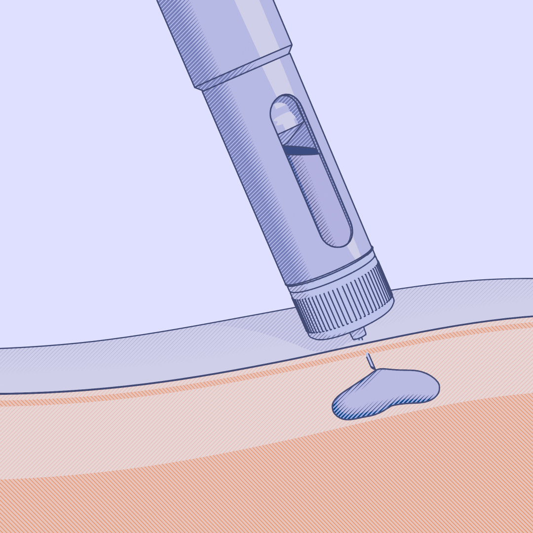
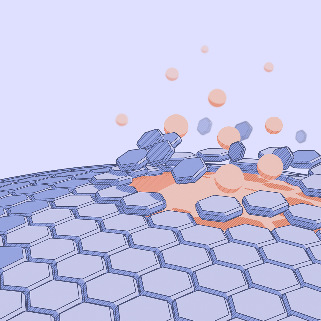
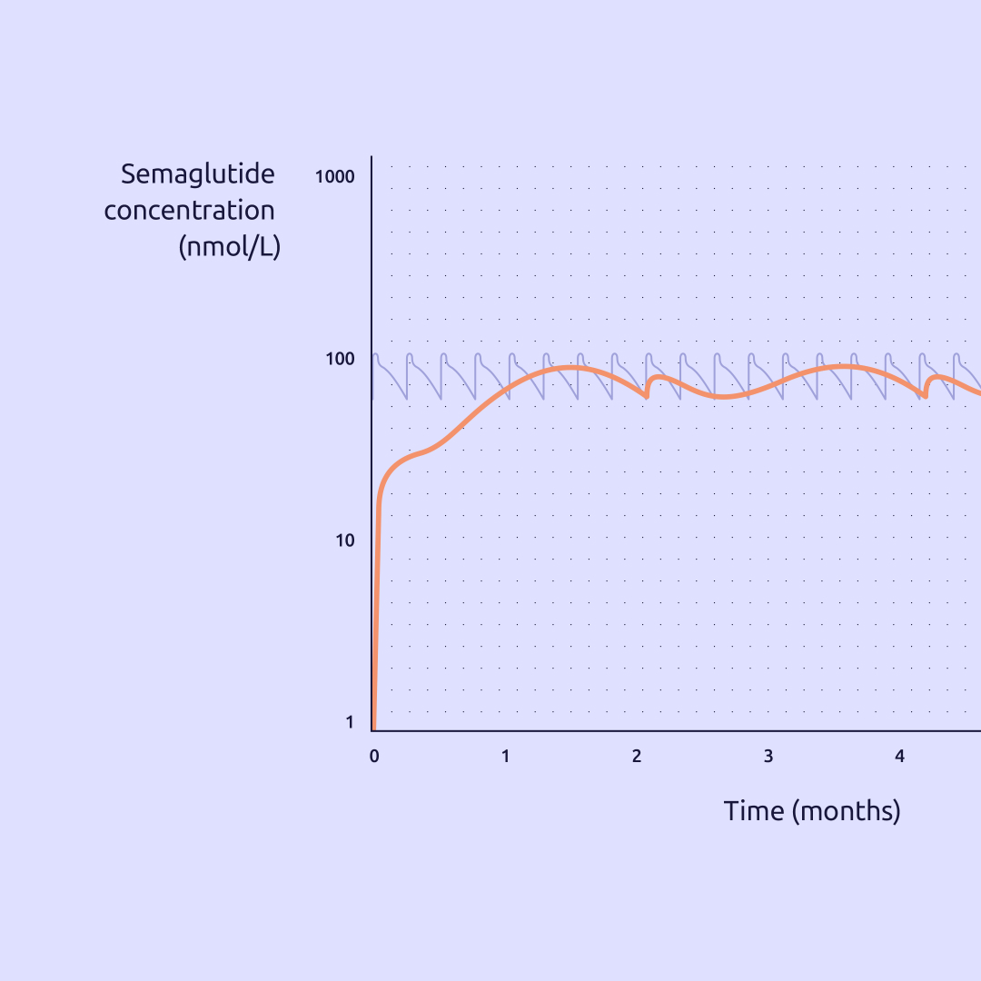
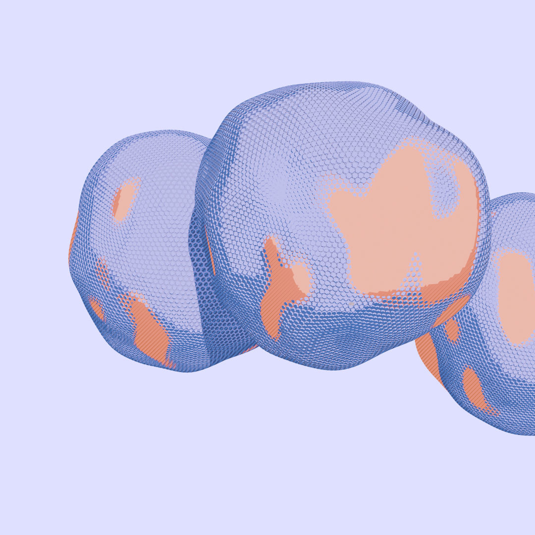
We developed a unique illustration style to communicate Nanexa’s innovative technology to both scientists and the general public, creating a distinctive visual language that stands out within the scientific landscape.

The delivery
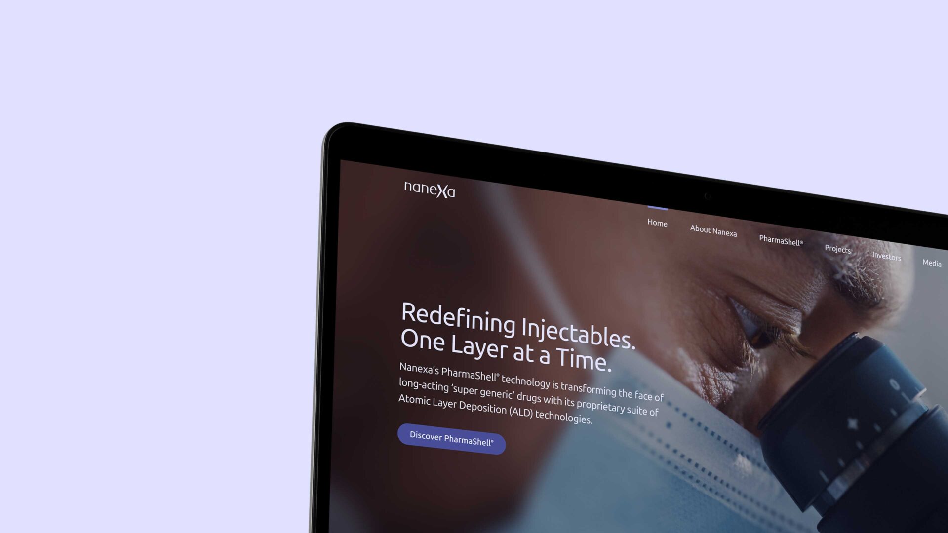
The complete brand identity includes a new colour palette, refined typography, dynamic graphic elements, a distinctive image and illustration style, ready-to-use artwork, a website update, and corporate materials.